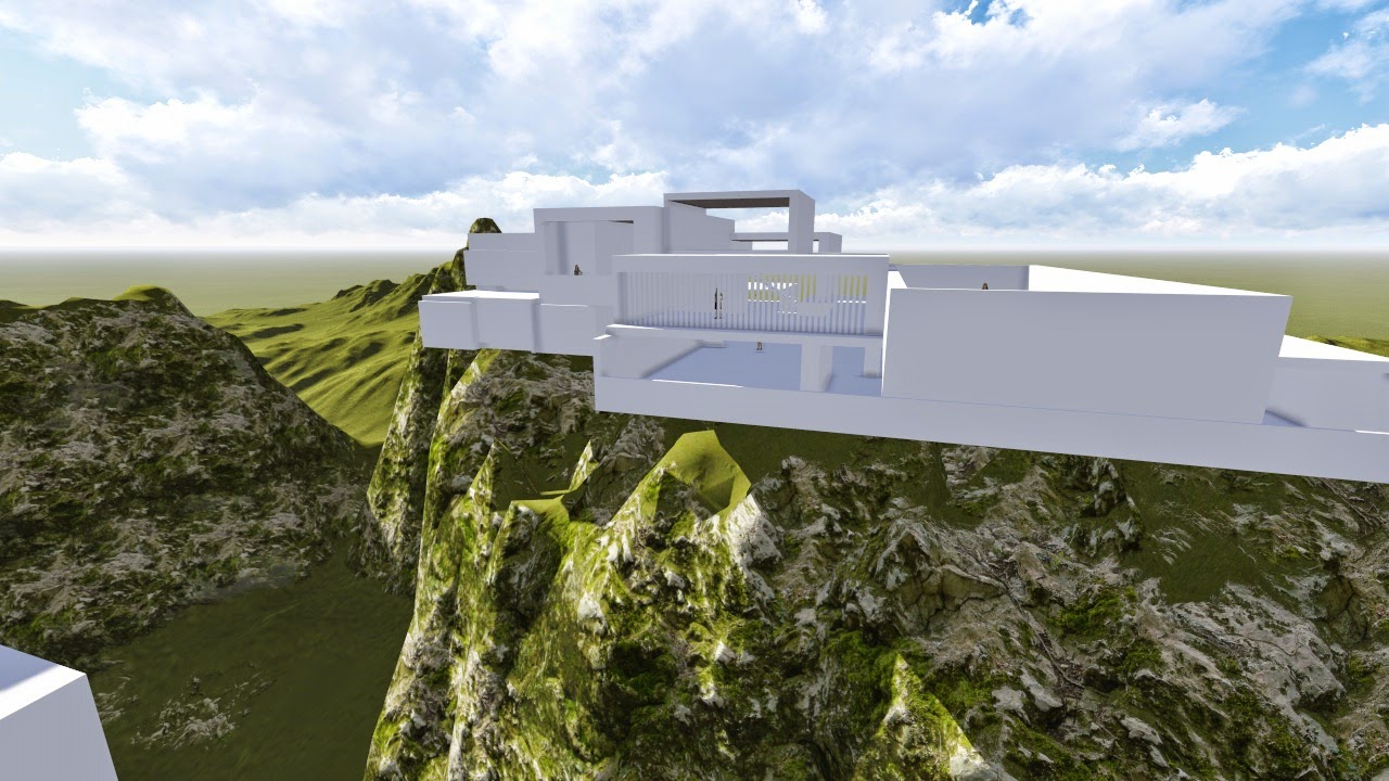
Final 5 Real Time Images
Bird's eye view of the environment.
View from moving element #2 at the folly.
View in the lecture room from moving element #1.
The workshop and studios from the mountain pathway with the cross generated by the shadows.
Staff offices and meeting rooms.
The design of the bridge and folly is based on using simple geometry to create complex and dynamic forms. In other words, complex simplicity to generate chaotic organisation.
The way in which the simple shapes are placed in relation to each other gives it a more dimensional and powerful appearance. This projection of forms is achieved through the offsetting of the various components. The juxtaposition of the different shapes also highlight their respective forms. For instance, the circular column against the rectangular structures make the blocks seem sharper.
Extra Images
Entrance to the Gallery. (Note: the panel in the centre is supposed to be a mirror and not a painting).
View of the lecture from Moving Element 2.
Staff Offices and Meeting Rooms.
Staff Offices and Meeting Rooms.
Studio rooms and computer room above it.
Detail of the roof of the second Studio Rooms Unit.
Overview of the Bridge wrapping around the mountains.
Moving Element #1 which acts as an elevator travelling between the gallery and staff offices.
The Folly
My original design had the vertical walls lower which
blocked any possibility for students to view the environment, reducing the
quality of the social event. By lifting the walls up, everyone is able to socialise
and see each other. It also gives the folly a more interesting form.
I've also added unorthodox
elements such as a ladder, monkey bars, climbing blocks and a balustrade only on the 2nd
floor (and not on the top). This makes the folly more unusual and makes people
think about the architecture behind it. The red colour is also unconventional but it makes the folly stand out from the landscape while also complementing the beige colour of the bridge.
Stairs
Stairs at the Staff Offices.
These stairs are designed to be chaotic to make it stand out from the building, which is more streamlined and clean. It also makes it seem more natural, fusing it with the landscape which is also disordered.
Spiral Ramp from the library to the mountain which connects to the workspace and studios.
Like the stairs above, this ramp appears messy. It is inspired by the roots of a tree and is representative of the gateway and transition from the artificial world to the natural environment.
Stairs in student meeting rooms.
These stairs come out from the side of the mountain. This also creates a close connection to the earth, further supporting the integration of the building with the environment.
Stairs carved into one of the blocks of the folly.
NOTE : The best way to find out the function of each room is through the SketchUp file (the names of the groups) as using a section and plan is quite complex with this design due to the overlapping of rooms.
Link To Dropbox Folder
https://www.dropbox.com/sh/igjhszgmqzhxrgd/AAAlE0ILCnKEV1tMBbnQMhOba
Final Lumion File: Lumion 4 > Scenes > "Jimmy Le_EXP3"
NOTE : You can reduce the resolution of the trees in lumion if the program lags.


